SEPTEMBER 2024
Self-publishing is like a dark tunnel that has suddenly filled with people poking flashlights in my face and telling me to follow them to the light at the end of the tunnel, before taking me back the way I came and then handing me the bill for their services. What to do?
Well, I’ll finally be publishing An Ultrakey for Dione on Amazon at the end of this month, and I’m going to try something slightly different. For anyone who hasn’t read it yet, and is interested, it will still be available as a free download until then, as a sort of “advanced review copy” that’s been out there for nearly a year! And at the start of October, I’m also planning to make it free from the Kindle store for a few days. The idea is that anyone who fancies downloading the “real thing” will also have the option to leave a juicy Amazon “verified review” (reviews are everything!).
More about that next month, although I’ll try to keep things as simple as possible. Anyway, here’s a reminder of what Red looked like with very short hair:
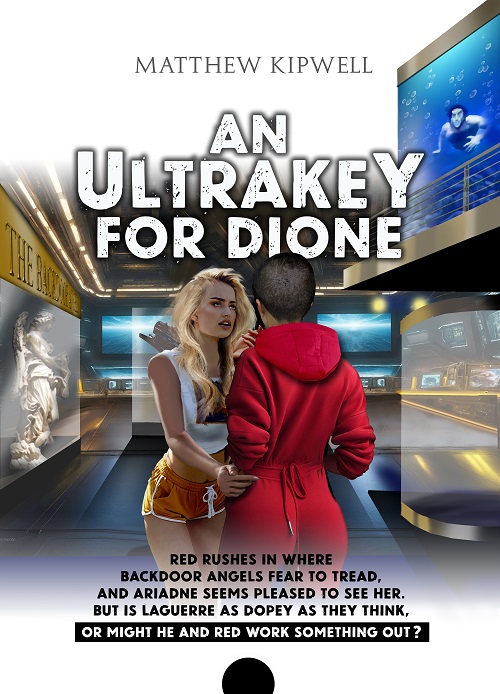
And from that particular cover (you knew the blonde was an android from the beginning, right?) to book covers in general. Obviously, when you float a free book in the middle of a “group promotion” on one of the freebie platforms or pop it up there on Amazon – as an unknown author – the cover is crucial: it either entices, repels or (worst of all?) leaves potential readers indifferent. And while I still find the dull and uninspiring covers of the Harry Potter series that my lads used to read a bit surprising, it proves the point that the more popular the previous books in a series (and the more famous the author), the easier it is to market the next one. How boring for everyone involved!
One of my early mistakes with my own covers (apologies, yet again, to Paco, my old friend and long- suffering graphic designer) was that I wanted to summarise the entire story in a single image: Roland in the middle, Mar over there, and Red disappearing round a corner on the right; a taxi without a driver; a futuristic cityscape; a black rucksack containing …
I made a conscious effort to improve things with the recent book set on Rhea, giving Paco just three or four ideas to play with, and I was delighted with the result. But then I started to wonder … Was that mouth a little too “sexy”? Was I giving potential readers the wrong idea about the book itself? Had I reduced the woman represented on the cover to a passive victim? And might some people find the combination of the mouth and the gun deeply disturbing?!?
Obviously, the cover has to grab the attention, but it must not turn into clickbait. In other words, it has to give the potential reader the right idea about what they’re going to find inside. At the risk of annoying Paco yet again, I asked him to make a small modification. And here we have the “before” and “after”:
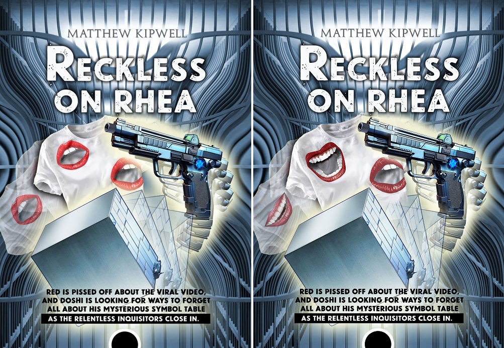
I’m not going to ask you to vote, but if you’ve read the novella itself and have an opinion on which of the two is most appropriate, I’d be delighted to hear from you! And if you think I’m wasting my time on irrelevant details, that might also be a point worth making! Perhaps I’m guilty of flashing lights in my own eyes?
By the way, if you missed the download, I’ll be making it available on the website from next month onwards.